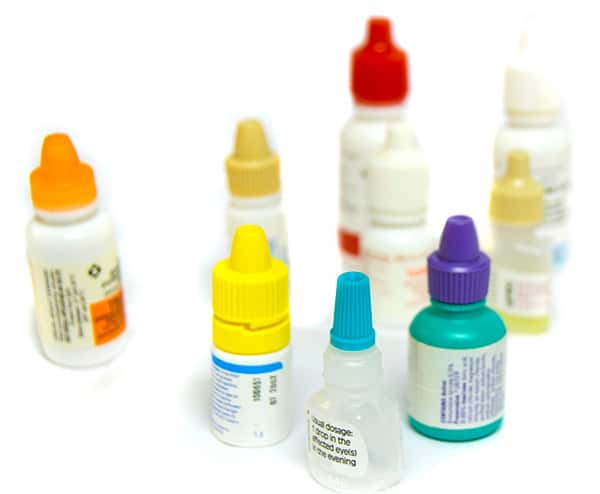
The first part of this project was to research and define what our design problem was. By doing research, we could better understand the problems users were facing when using eye drops. What our findings showed was that eye drop bottles were commonly confused with similar looking bottles, such as ear drops and super glue.
We then came up with a problem statement that would help us narrow down the issue and allow us to have a concrete goal in mind.
How might we redesign the packaging for eye drops in order to make them distinguishable from other similar product packaging?
Through our own research and user testing, we were able to address key issues with the original packaging seen here. Key issues included:
- Small product label
- Weak imagery
- Inconsistent hierarchy and typography
- Poor contrast in type
- Missing or hard to find information

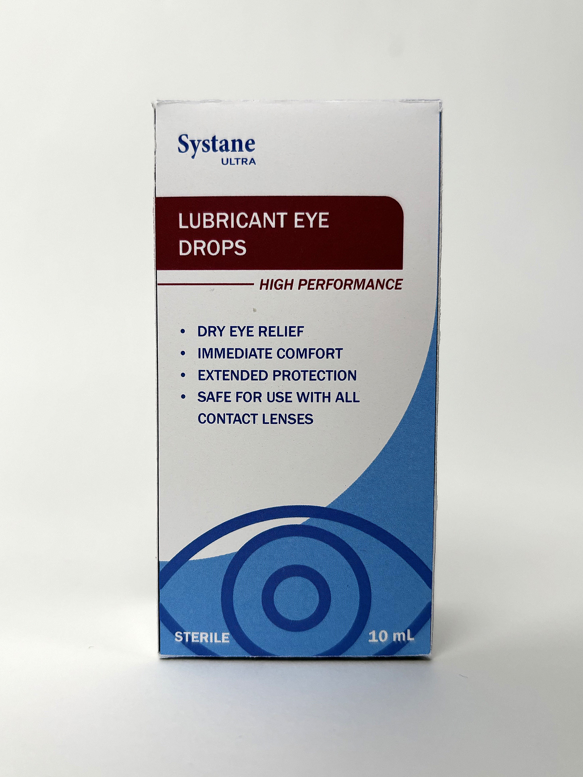
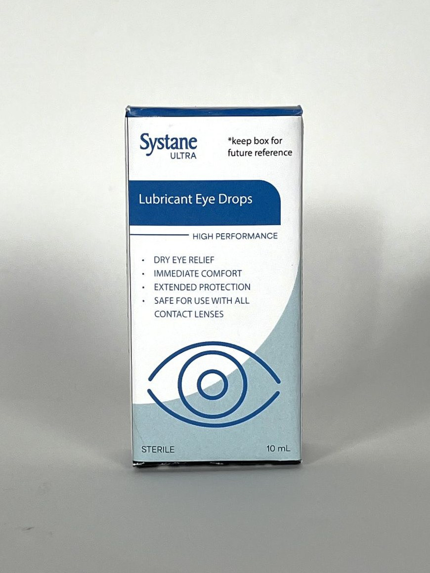
Original Front
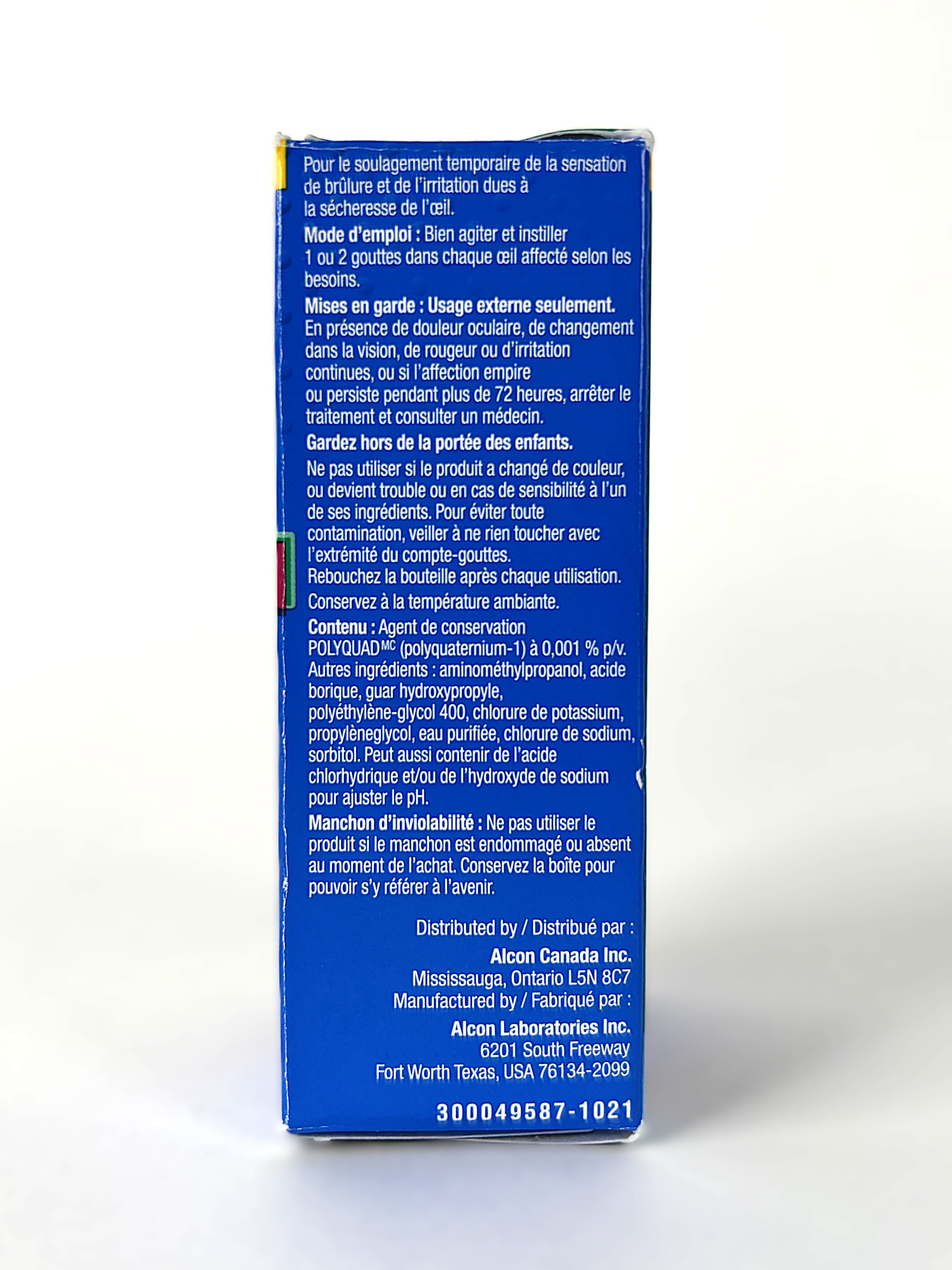
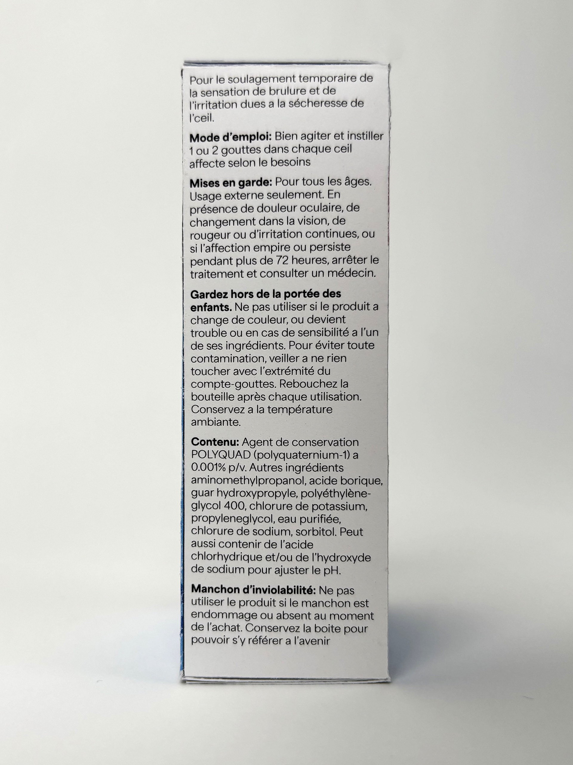
Original French Side

Original English Side
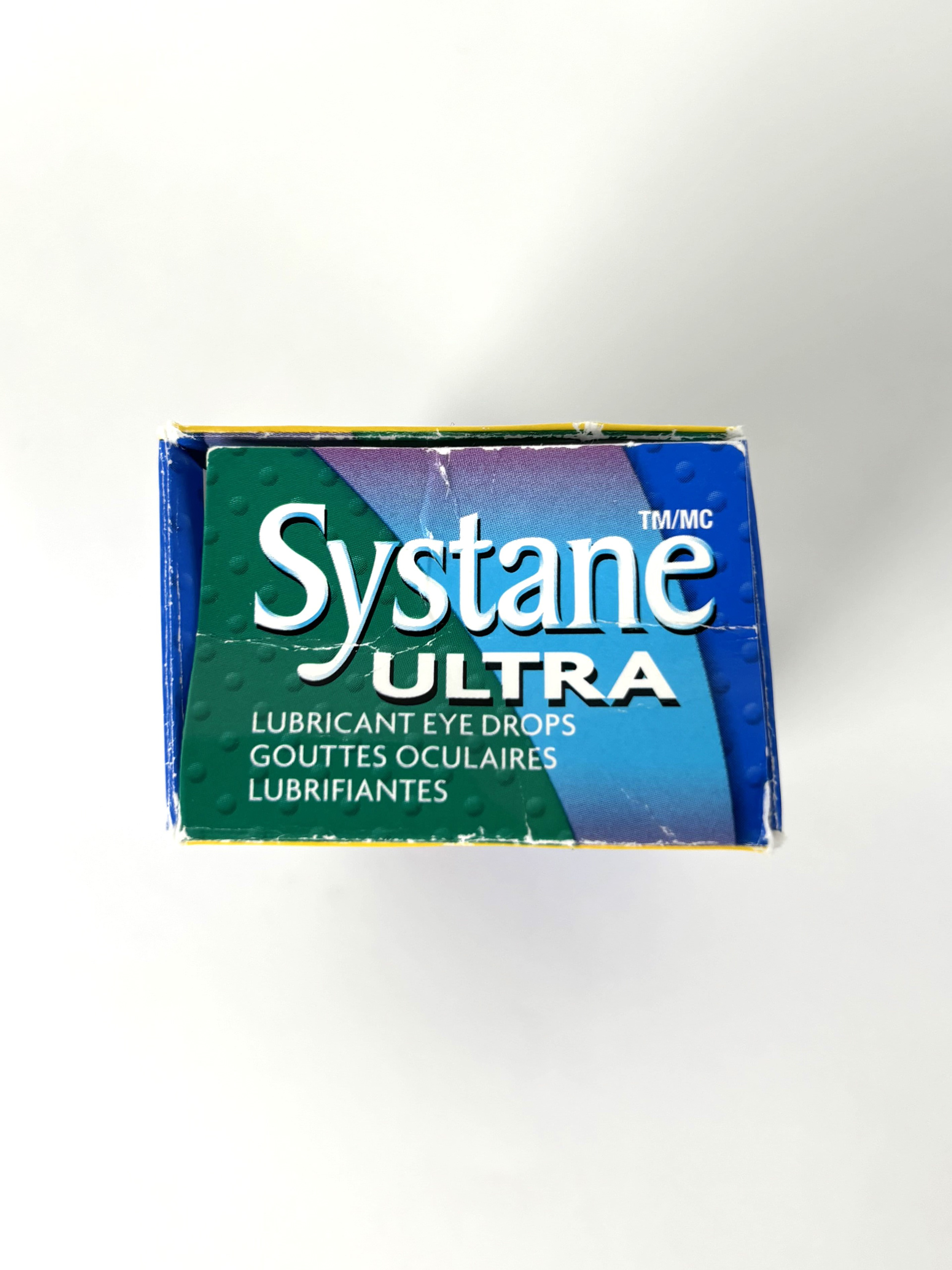
Original Top
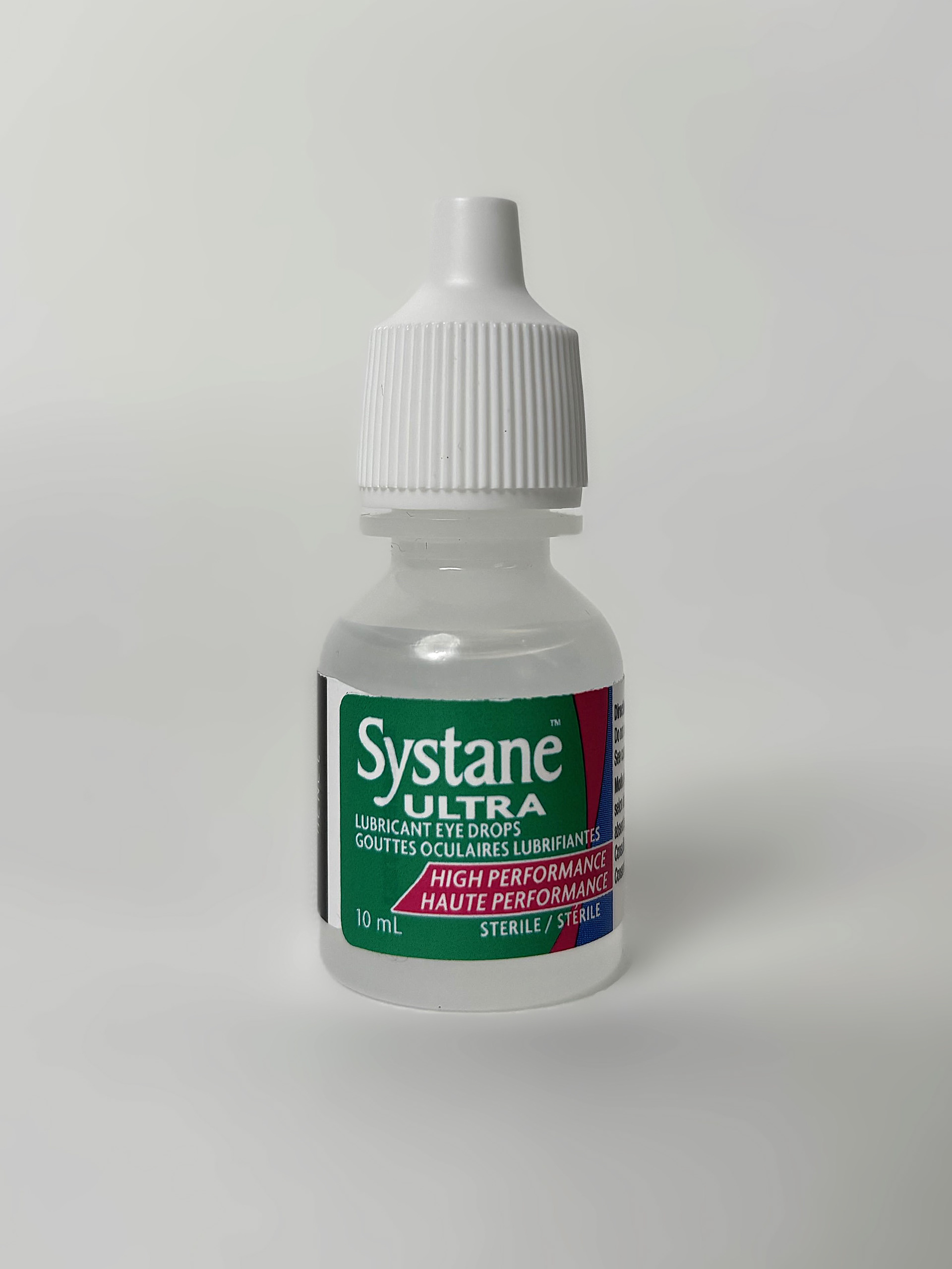
Original Bottle Front
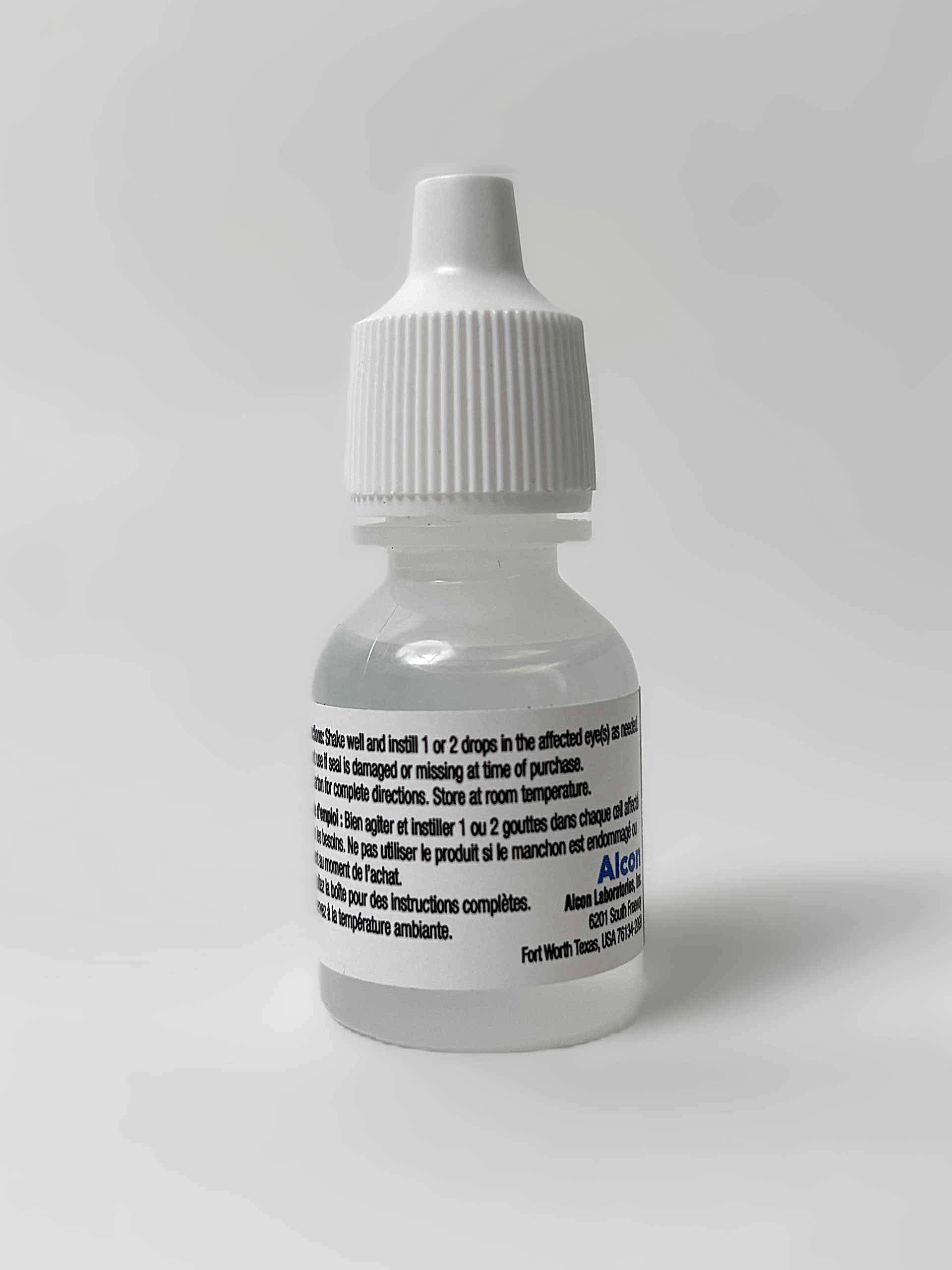
Original Bottle Back
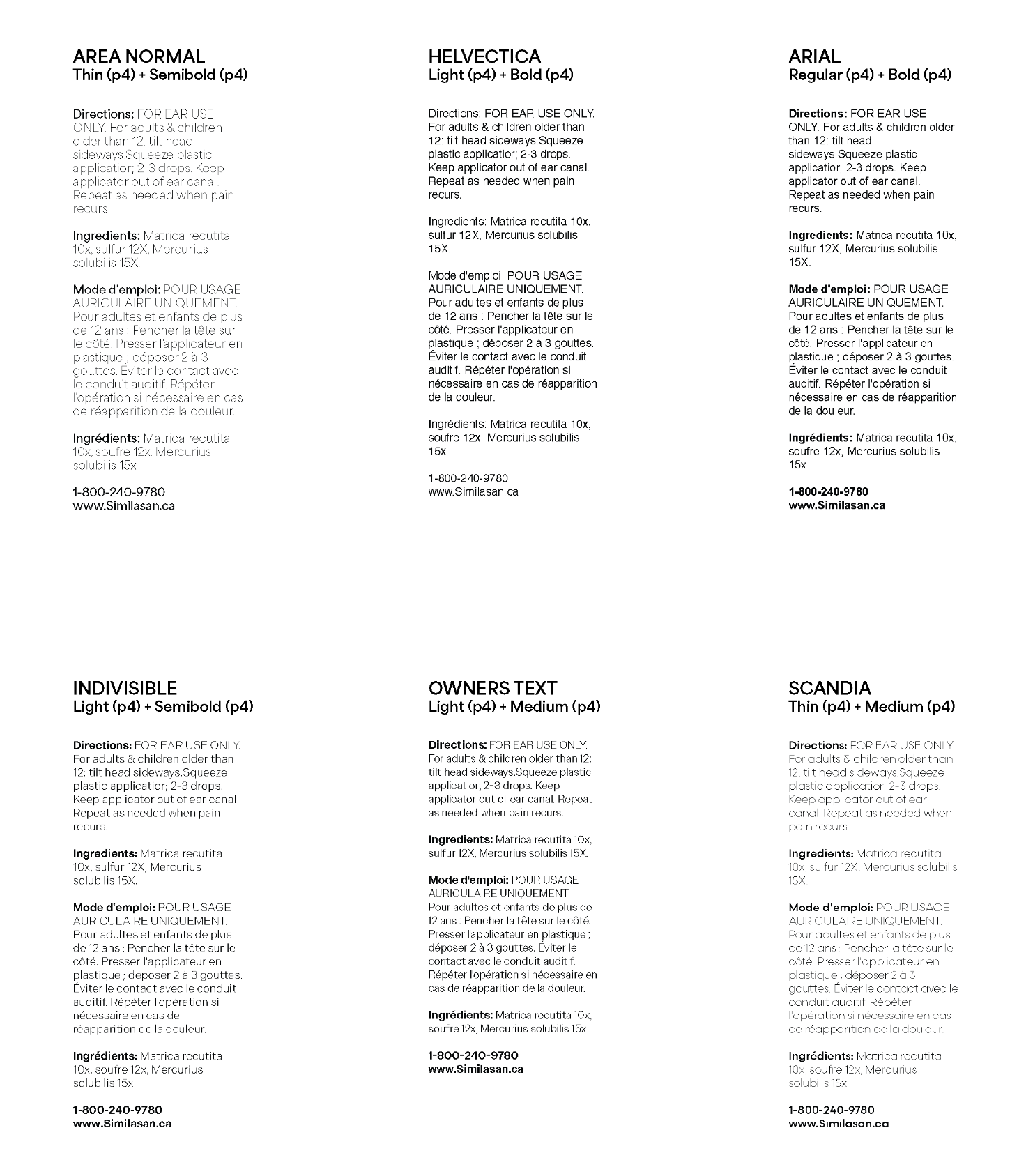
Type Test
A key part of this project was information design. To ensure that the information on the packaging was easy to read, we conducted a type test. Different typefaces were tested against each other to help us decide which one was most effective at a small scale while remaining legible.
Through this test we decided on Area Normal as it was legible at a smaller scale and the differentiation between thin and semi bold was effective in breaking up information.
Once we had found the key issues with the original packaging, we could focus on the redesign that would help mitigate these problems. Our first iteration focused on simplifying the design and highlighting important information.
We also added an eye icon so the box was easily identifiable as eye drops. The body text was made black and placed on a white background to help with legibility.
First Iteration Flat
First Iteration Front

First Iteration 3/4

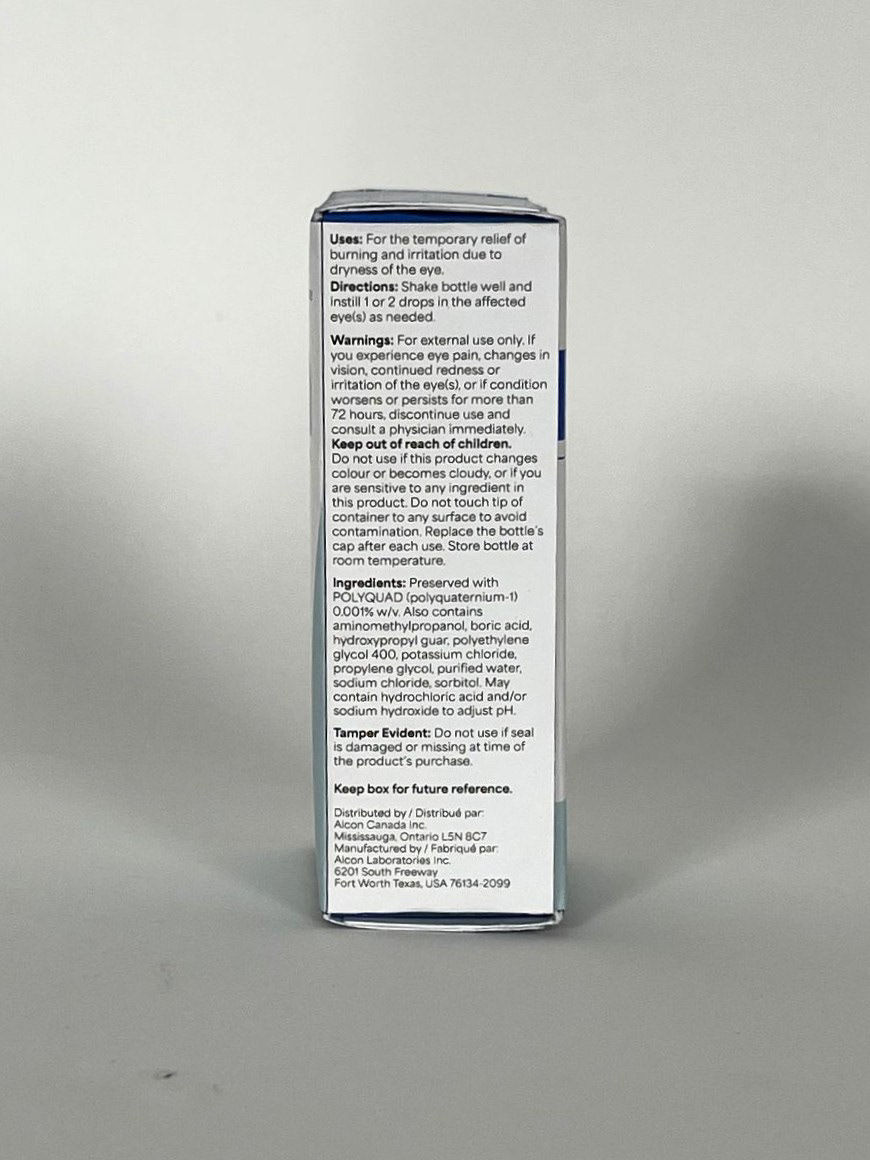
First Iteration English Side
First Iteration French Side

First Iteration Top
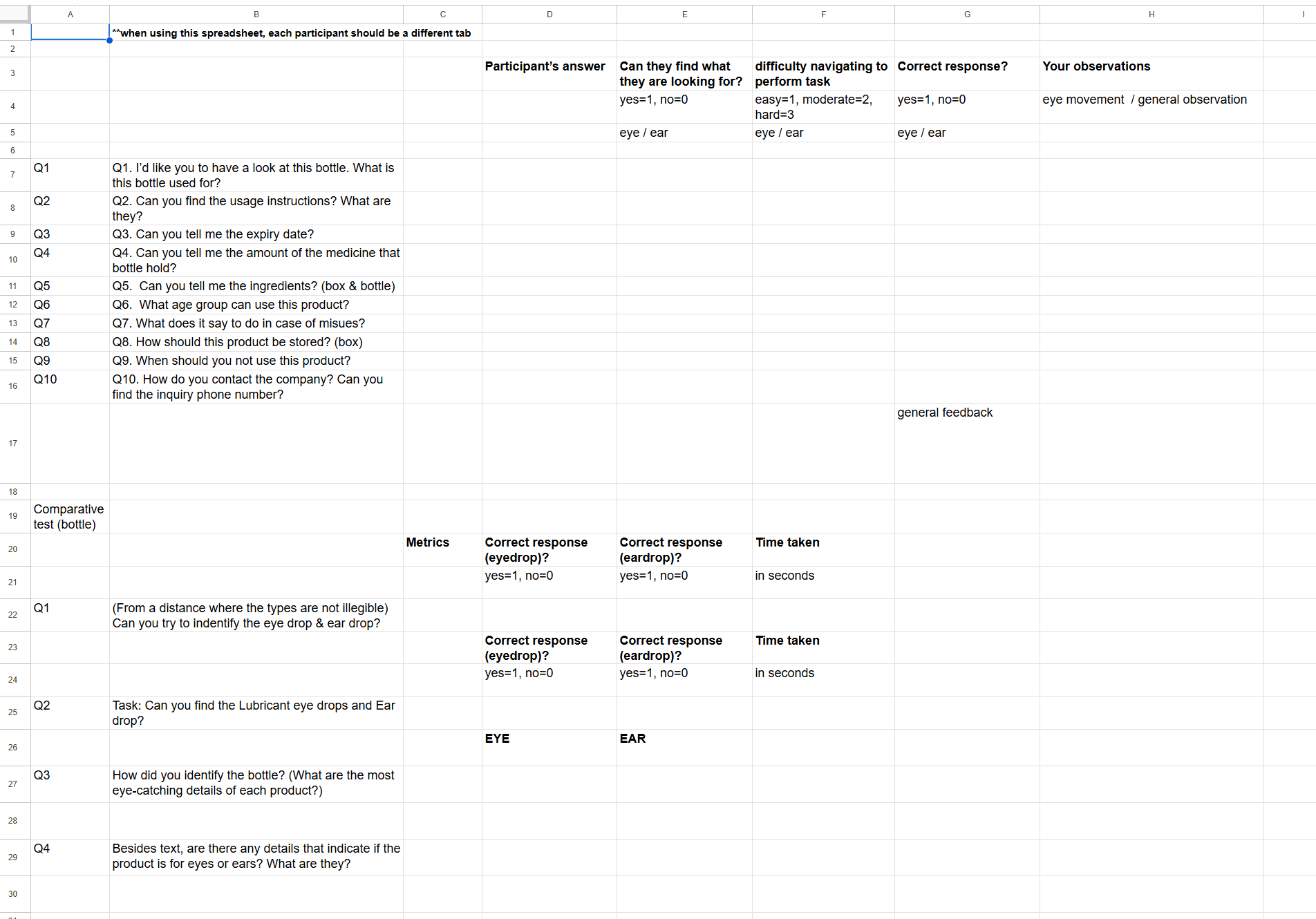
User Testing Questionnaire
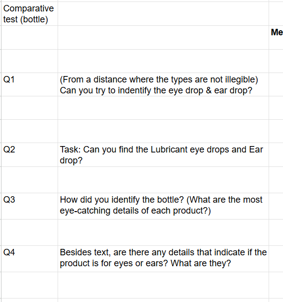
User Testing Question Examples
After our first iteration was created, we could conduct a secondary round of user testing. We asked the same questions as our first round to see if our changes had made a positive change. Through this testing, we found that users could better locate information that was previously difficult to find, and the packaging was more identifiable as eye drops.
Users pointed out that the contrast in the imagery could be improved and that the red text box was possibly distracting. We were then able to apply these findings to our second iteration of the packaging.
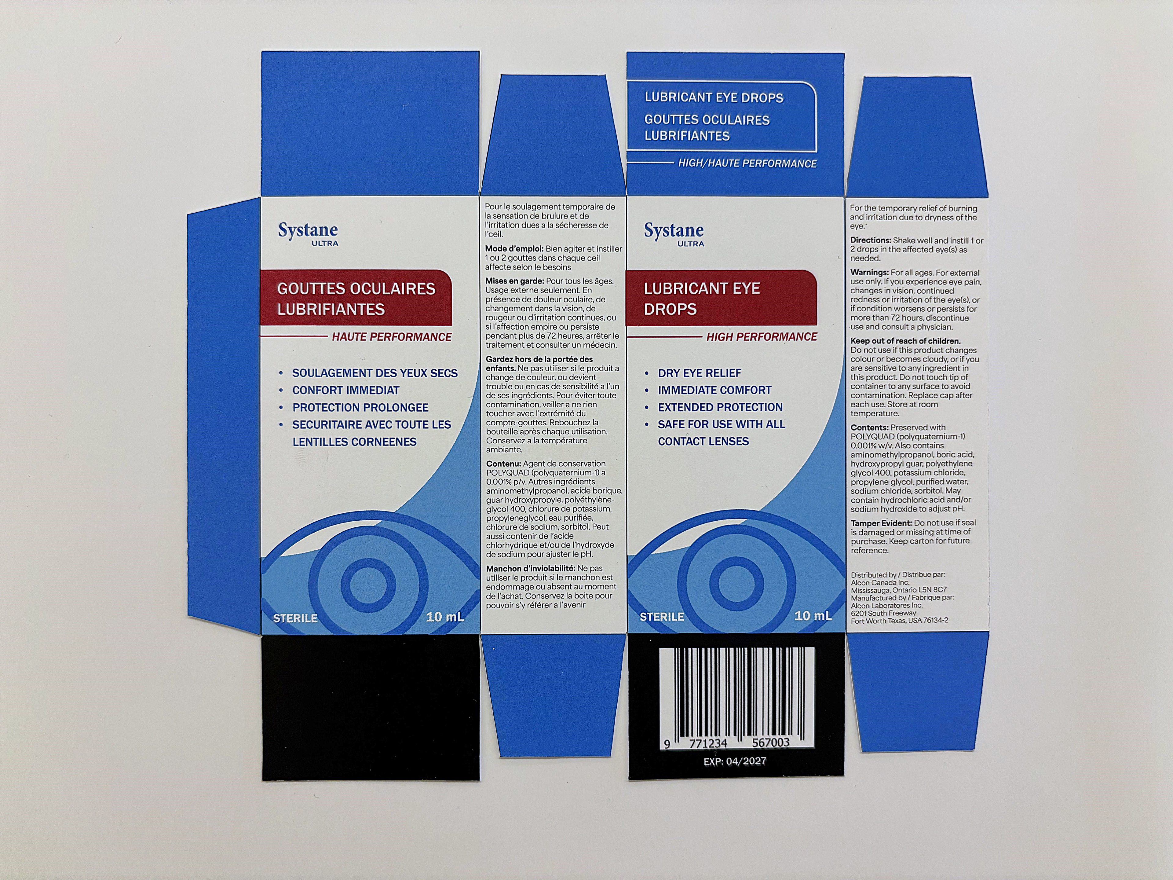
Final Front

Final 3/4
Final English Side

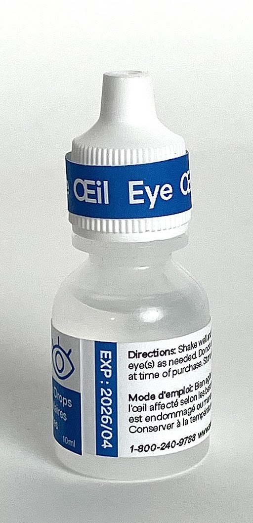
Final Bottle Front