Colour & Typeface
Before creating the "Wine Stomp" logo, I first decided on the colours and typeface that would be used for the visual identity of the event. The main colour used is maroon, reminiscent of a red wine. The secondary colours are a simple black and white, allowing me to work with high contrast imagery.
Two typefaces were chosen for different uses. It was important to choose a typeface that would be more legible for body text while choosing a typeface with more character for the logo and tagline.
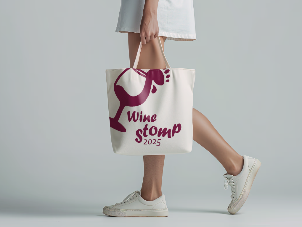
Once I had decided on colours and a typeface, I could begin working on the logo. My event was focused on wine and also involved a grape stomping marathon, so I felt that it was important to incorporate imagery of these components. The first iterations include a wine glass and a splash in the shape of a foot. The name of the event is seen below with the year that the event is taking place too.
First Iterations
Final Logo Design
My final logo design was simplified so it is more legible at smaller scales. The logo becomes one identifiable shape instead of several smaller shapes. This not only makes it more striking, but also more versatile when working in many different forms.
The different components of the logo are identified, helping audiences with less familiarity with logo design to understand the role each part plays. The graphic element in this case is the wine glass image, the tagline is the event name, and the static ground is the background the logo lies on top of.
The final logo design was the used to make different variations which could be implemented in different ways. The original logo is available in a reversed and coloured option. It is also displayed in a horizontal and vertical orientation.
By creating different variations of the original logo, it can be applied to many different forms and backgrounds, which is important when creating a larger scale event where the visual identity will be used in different ways.
Logo Variations
Logo Help Sheet
Alongside the visual identity, I created a help sheet that users can refer to when using the logo. The help sheet includes a "Do Not" section, advising the user of possible misuses of the logo. It is important to keep the logo in its original form so it can be used effectively and consistently.
The sheet also contains a recommended file format chart to help users when deciding what file type to use for what project. Some formats are more versatile than others and so it is important to discuss with printers to decide which file type is preferred.
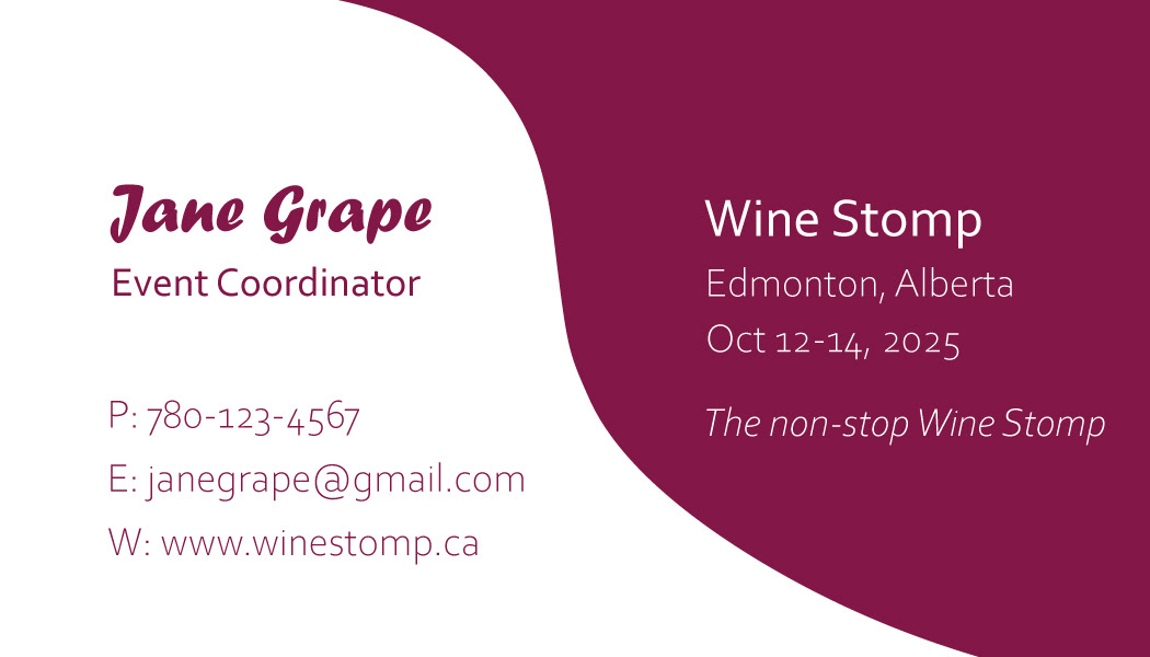
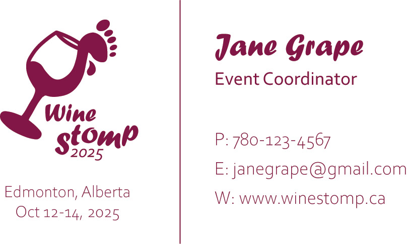
A part of creating the visual identity was creating a business card and email signature that staff could use at the event. By creating these, staff are linked directly to Wine Stomp, and correspondence is consistent and identifiable.
It also adds credibility to individuals using the business cards and signature. They both contain the Wine Stomp logo and remain loyal to the visual system I have created.
Email signature
Business Card Back
